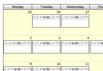
EventStart/End display on DayPilotMonth with ext overlapping?
Asked by LarryDavidJr 14 years ago.
Hi,
Am using the month view to display events. Have a fairly simple implementation as below. With these default settings the time slots are 'over' the displayed text (as in attached pic), which seems odd as a default implementation. Is there something I have to change in the styling to do this? Or should it display one below the other by default?
It doesn't matter how tall I make the event box, the text DIV still overlays the absolutely positioned time DIV's. Overriding the absolute positioning and setting float left/right/clear on the relevant elements and leaving the width and height as auto gives the desired effect, so I'll probably do that. Either that or override the event rendering to just add the time in to the text.
Thanks anyway.
Comment posted by Dan Letecky [DayPilot] 14 years ago.
I'm not sure why it was implemented like this instead of using the floats. Probably there was some browser incompatibility involved. Maybe it's time to revise that. Please let me check.
Comment posted by LarryDavidJr 14 years ago.
That would certainly make sense. It probably works better with the default event size too, just didn't quite work for my situation. No matter, got a workaround now. Thanks for your help.
Comment posted by Dan Letecky [DayPilot] 14 years ago.
There is now a third EventTextLayer mode available: EventTextLayer="Floats". It arranges the elements using float:left (the start time) and float:right (the end time). It's available in the latest sandbox build (6.9.2524):
It will need some polishing but it seems to work fine.
Comment posted by LarryDavidJr 14 years ago.
That seems to work pretty good. I added a 'clear: both: to the value element when testing to push the element below the times, otherwise it looks a bit odd when a multi word value can partially fit in the top line (see attached Tues 26th 'Lucie chick' ). Whether that's actually desirable as a default or not I don't know.
 DayPilot